
In reviewing my last blog post about my logo work, I realized that I had skipped over a critical part of any Maker’s blog: describing my process. Unfortunately my logo did not spring fully formed from my brain like Athena from Zeus’s forehead, though that would be quite the sight. Instead this was a project that required thought and a lot of interations.
Brainstorming Sketches
I like to create thumbnails in a notebook so that I’m not tempted to fall down the myriad digital rabbit holes that modern illustration applications offer. Here’s a sample of my initial ideas which date back to July 2016:
Kitchen Sink
This sketch captured nearly everything I associated with the types of Maker projects I want to create:
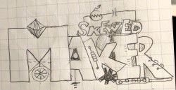
I think it would be fun one day to create a working version of this, but its complexity breaks several of the principles of good logo design.
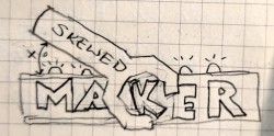
Simpler
In this sketch I boiled down the contents of the Kitchen Sink. I focused on both improving the readability of the name and simplifying the representational details:
Elemental
From the Simpler model, I pivoted toward an elemental logo that factored out the representational imagery and focused instead on the site name because the early days of any brand are about maximizing name recognition. I also started thinking that a square format would be more versatile than a landscape:
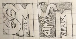
I wasn’t thrilled with either of these sketches but did feel like I was headed in the right direction.
Going Digital
Well, six months elapsed between my creating these initial sketches and my being ready to launch the first pass of the web site. In that period I managed to misplace my notebook and completely forgot where I left off in the logo design process. I started over, this time opting to work directly in my online graphics editor, Stencil.
I started with a simple, representational logo, drawing on two primary elements of my brand: electronics and woodworking.
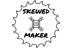
This was an okay start, but it left me with a clipart cheesiness after-taste. If there was no way that I would click on it, why should I expect anyone else to? Plus, I doubted anyone would be able to figure out what the items in the middle were when viewing it scaled down on a mobile device.
With that in mind, I simplified the design to use a single LED and added a woodgrain texture to it:

This was better, but it still lacked any real visual oomph. Further still, when I scaled it down to different sizes, the LED was tough to make out and it still failed the Would-I-Click-On-It test.
Back to the Drawing Board
I went back to the drawing board again, this time reviewing some of my favorite Maker channels on YouTube to see what I liked about their logos. The two that made the strongest impact on me were:
 |
Credit: David Picciutto |
 |
Credit: Bob Clagett |
Both of these site’s logos are simple, high contrast, and scale very well from small to large, with I Like To Make Stuff scaling down to remove the text when a thumbnail-sized icon is needed.
Iterating to a Final Design
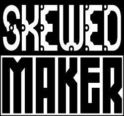
Taking my cues from these two logos, I came up with a simple typographic logo with two levels of visual contrast: the typefaces and the color/background.
Typography
Being mindful of my budget, I leveraged the fonts available on my Linux box rather than buying typefaces from a foundry or using a Google font. I liked the curves and rivet styling of Granular BRK for SKEWED, which I feel gives it some personality and implies tooling or craftsmanship. Zephyrean BRK provides MAKER with weight and serves as a solid anchor to the type on top.
Color/Background
I think that the high contrast color scheme aids readability as well as lends itself to easy variations for project-specific or seasonal themes. Bob Clagett does this to distinguish between his two YouTube channels, the first one using an orange background and the second using a blue background. I haven’t created any examples of these yet, but that’s a project for another time.
Next Steps
In my next post, I’ll provide highlights of the logo implementation process, such as the decision to generate web fonts for the page header versus using a static image.